


")
Whitepaper Design
Project Overview
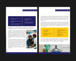
We designed a 27-page whitepaper using Figma, ensuring a clean, professional, and engaging layout. The document provides in-depth insights into technology in primary healthcare and strategic advancements.
Design Approach
-
Minimalist & Professional Aesthetics
-
Used a clean, modern layout with structured typography for readability.
-
Incorporated corporate-friendly colours (blue, white, and soft accent tones) for trustworthiness.
-
-
Content Structuring & Organization
-
Well-defined sections: Title pages, Executive Summary, Chapters, Sources.
-
Implemented clear visual hierarchy to guide readers through key insights.
-
-
Visual Enhancements
-
Used icons, infographics, and images to complement the text.
-
Balanced text-heavy sections with engaging visual elements.
-
-
Figma as the Primary Tool
-
Designed in Figma for seamless collaboration and version control.
-
Optimized for digital exports (PDF & PNG) for various distribution channels.
-

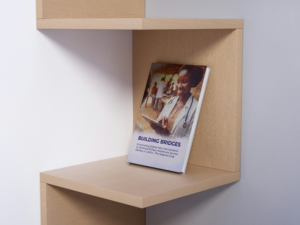
Final Outcome
A polished, easy-to-navigate whitepaper ready for publishing, and digital distribution.