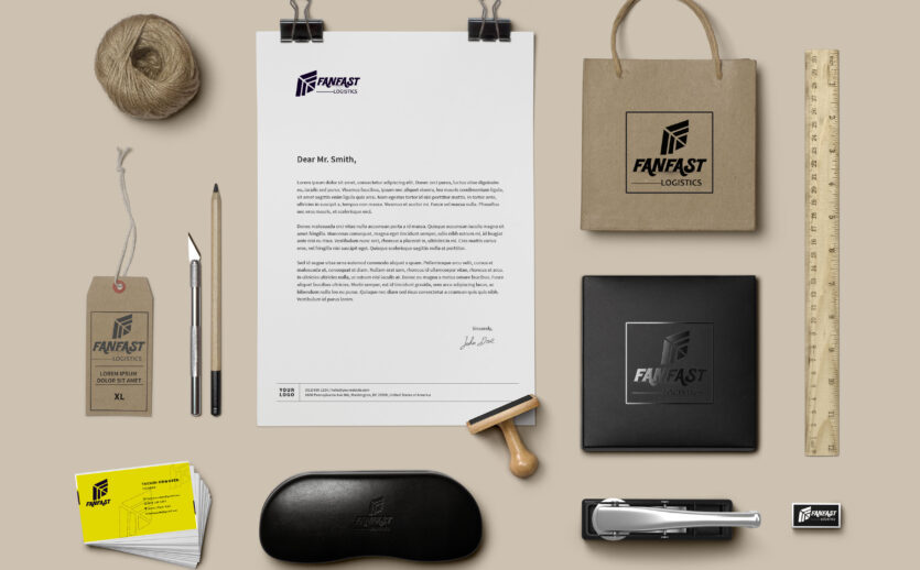
FanFast Brand Identity Design
Project Summary
FanFast is a dynamic brand operating both a logistics service and a café in a student-dominated area. The café specialises in snacks such as pizza, burgers, smoothies, and other natural drinks, while the logistics arm handles deliveries within the state using bikes.


Project Brief
The client needed a simple yet versatile logo that represented both aspects of the business—logistics and café—while maintaining a cohesive parent identity. They wanted a design that was distinct for each service but visually connected under one brand. Additionally, they required social media flyers to establish their brand presence online.

Our Delivery
We created a bold, stylish text-based logo that effectively captured the brand’s essence and a geometric shaped F letter that looked like a kite or sliced pizza o capture both services. “FanFast” was designed with a strong, modern font, while the sub-brands (Logistics and Café) were placed beneath it to distinguish their services. To reinforce the visual identity:
-
Café: We used a vibrant red and yellow color scheme to evoke warmth and energy.
-
Logistics: We opted for a black, purple and yellow combination, symbolizing speed and efficiency.
Beyond logo design, we developed engaging and visually consistent social media flyers to enhance FanFast’s online visibility and brand recognition. We also gave the client a brand guideline document.


